August 31, 2025
You’ve booked the venue, wrangled the speakers, and maybe even decided on the snacks (very important). However, what about your event graphics? If they’re just an afterthought, they might quietly be working against the vibe you’re trying to create.
The truth is, great visuals do more than just “look good,” and they welcome, guide, impress, and linger in your guests’ memories long after the last name tag has been peeled off. In fact, pairing visuals with text can improve information retention by up to 65%, compared to just 10% with text alone.
Whether you’re planning a corporate summit or a cozy creative meetup, choosing the right graphics is your secret weapon for setting the tone, telling your story, and standing out.
So, let’s make sure your event looks as brilliant as it’s meant to feel.
You wouldn’t wear a tux with flip-flops. So don’t let your event visuals send mixed signals. Visual consistency isn’t about being flashy or fancy. It’s about presenting a clear, unified identity that builds trust and instantly communicates professionalism.
Here’s what that looks like in practice:
Email headers should echo the same tone and style as your event landing page.
Name badges are practical. Consider them as mini brand ambassadors.
Banners, slides, and signage need to feel like they’re speaking the same design language.
Mobile apps and virtual platforms should visually mirror your in-person experience.
Even a simple style guide can make a huge difference. It doesn’t have to be complicated. Just a basic one-pager outlining your fonts, color palette, logo use, and image guidelines will keep your entire team (and your vendors) aligned.
“Consistent brand presentation across all platforms can increase revenue by up to 23%.”
Source—Lucidpress Brand Consistency Report via Forbes
Set up a shared folder labeled “Branding Kit” that includes editable templates for everything. Social posts, speaker slides, badge layouts, and even booth signage. Distribute it early and watch how much smoother design collaboration becomes.
Consistent visuals make your event look polished, and they reinforce credibility at every touchpoint. And in the eyes of attendees, sponsors, and speakers, that kind of detail speaks volumes.

Sometimes, a design that looks polished on screen ends up barely visible when printed or projected. That’s because great design doesn’t only live inside Canva or Figma, it lives in physical spaces, on mobile devices, under harsh lighting, and across countless screen types. You have to design for the environment your graphics will live in, not just the file format you export them from to engage the audience.
Let’s say your banner is going up in a bright atrium with tons of natural light. Pastel text on white? Probably gone before anyone notices it. Or maybe your signage is set against a busy vendor backdrop. In that case, your visuals need strong contrast and a clean layout to stand out, not blend in. Context changes everything.
Then there’s scale. Something that looks sharp and well-balanced on your laptop can look empty or unreadable from 10 feet away. Banners and stage visuals demand fewer elements and larger fonts. 20 to 30 percent bigger than you'd typically use on a screen. Keep the core message front and center, and let go of anything that clutters from a distance.
Virtual and hybrid events come with their own curveballs. The reality? Most attendees are engaging on their phones first. If your text is too small, your images aren’t optimized, or your design relies on details that vanish on mobile, you’ve already lost them.
And it’s not just about screen size. Low bandwidth, outdated browsers, or cheap projectors can strip your graphics of their punch if you’re not thinking ahead. Test your visuals on phones and tablets and under bad Wi-Fi, not just under ideal conditions.
“As of May 2025, mobile devices account for 64.14% of global web traffic.”
Source—Exploding Topics
Design should travel well. Because no matter how beautiful it looks on your laptop, if it doesn’t hold up in the real world, it’s not working for you—it’s working against you.
Tossing in a fancy font or layer of texture might feel bold, however, if no one can read it, it's just noise. Creativity should elevate clarity, not bury it. Slick visuals are great, and legible ones are essential.
Users form design opinions in as little as 50 milliseconds, that’s 0.05 seconds, based purely on visual appeal
Source: Taylor & Francis Online
So yes, your choice of typeface, spacing, and contrast matters, and fast. In real-world settings like hallways, trade-show floors, and mobile feeds, people don’t linger. They scan.
That's why we stick to:
Two–three fonts max: You get style without the clutter.
Logical hierarchy: header, subhead, body. All the visual roadmap needs to be obvious, even if someone’s speed-reading.
Generous white space: Let your design breathe. Crowded text feels overwhelming; whitespace feels intentional.

Templates are a gift. They save hours, cut down on back-and-forth, and help your team move fast. However, when overused or under-customized, they can make your event feel generic, like you copy-pasted someone else’s party.
So the trick is using templates as a starting point, not a final product.
That Canva flyer? Great base. Now tweak the fonts to match your event branding. Adjust the color palette. Replace the stock image with something authentic or, at the very least, not overused on 17 other event invites this month.
And when it comes to event planning or event platforms, go beyond logos in the corner. Customize background images, button styles, and speaker cards, and add compelling event highlights to feel cohesive with the rest of your visuals. If your platform allows branding, take full advantage. The more your virtual space feels like your event, the more credibility it carries.
“75% of consumers judge a company’s credibility based on website design alone.”
Source—Stanford Web Credibility Research (webcredibility.org)
Templates speed things up. They only serve you well when they’re shaped around your identity not someone else’s idea of “event ready.”
You can create your own “mini-template pack” for recurring events. Lock in dimensions, text styles, and layouts once, then reuse smartly without reinventing the wheel every time.
Look, tools like Canva and Adobe Express have leveled the playing field. You can absolutely create good-looking graphics with zero design background. Honestly, there are moments when “good enough” just doesn’t cut it.
If you're hosting a high-stakes event like investor demo days, major industry expos, big-ticket fundraisers, or anything with sponsor dollars on the line, hire a professional. It’s not a luxury. It’s part of protecting your brand’s reputation.
A professional designer brings more than polish. They bring strategic thinking:
They’ll make sure your signage scales without pixelation.
They’ll know how to prep print files properly (so you’re not panicking when your banners look muddy).
They’ll understand how to maintain visual consistency across every asset—digital, print, stage, and social.
That said, you don’t need to outsource everything. Use DIY tools for fast-turn social posts, internal updates, and agenda slides. However, when it’s a touchpoint that shapes first impressions or earns trust, invest. It’ll pay off in how your event feels, how it's remembered, and who wants to come back next time.
“Design-driven companies outperform their peers by up to 228% on the S&P Index.”
Source—Design Management Institute (dmi.org)
If you can’t afford a full-time designer, find a reliable platform and build a long-term relationship. You’ll get consistency, faster turnaround, and someone who gets your brand without re-explaining it every time.

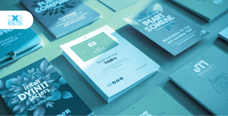
Design with intention. Every color, font, and layout choice should serve a purpose to guide, engage, and inspire your audience. Platforms like DXG make it easier than ever to customize your event platform’s branding. From banners to digital signage, ensuring your event looks polished and cohesive across all touchpoints without the hassle.
When you’re customizing your event platform with DXG, you’re partnering with a design pro; smart, consistent graphics are your secret weapon to stand out and connect.
Don’t settle for “just okay” visuals. Let’s create an event experience that feels polished, professional, and totally unforgettable. Reach out to get started on branding your event the right way.